Baroque II Dark Blue Wedding Invitation - Gilded Oval Frame on Damask
Free to create · 3-day trial · Pay only if you love it
Highlights
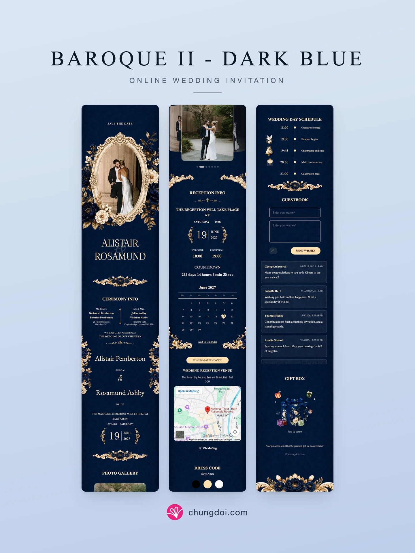
- Deep near-black navy ground covered edge to edge in damask
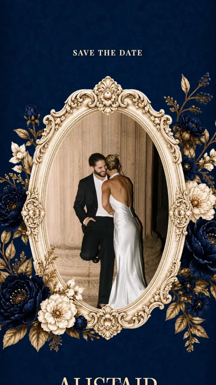
- Oval gilded mirror frame carved in full Baroque relief around the couple photo
- Hand-painted midnight blue and cream peonies spilling past the edges
- Gold filigree rules separating every section instead of panels
- Large wedding-date numeral between two gilded filigree flourishes
- Matching gift box and envelope in the same peony artwork
About
Baroque II - Dark Blue is the navy edition of the second-generation Baroque family. The ground is a deep, near-black navy covered edge to edge in damask, so every detail can be drawn in two warm Gold tones and still read clearly.
The card opens on an oval gilded mirror frame, carved in full Baroque relief, holding the couple photo and wreathed in midnight blue and cream peonies that spill past its edges. Below it the couple's names stand in a tall display serif, with an oversized handwritten ampersand fading behind them for depth.
There are no panels or colour blocks anywhere. Every section sits straight on the damask and is separated instead by a gold filigree rule centred on a single navy peony. A pair of tall gold and blue sprays flanks the family block, four carved corner pieces hold the reception details, and the wedding date is set as one large numeral between two gilded filigree flourishes.
Everything a couple needs is included: details for both families, the invitation text, ceremony and reception blocks, a live countdown, a photo album, a month calendar with a heart on the wedding day, Google Maps, a dress code, a wedding-day timeline with dove, cake and letter medallions, a guestbook, and a matching gift box and envelope printed in the same florals.
It belongs to the Blue family and keeps a Royal European bearing, cooled and calmed by hand-painted Floral artwork rather than plain metallics. If you want a classic dark-toned card that reads rich without being loud, this one fits. The same family also offers Baroque II - Dark Green, Baroque II - Dark Red and Baroque - Gold on bright ivory.
Perfect for
Features
- Customizable content
- Unlimited photos
- Google Maps
- Multiple languages
- Guest name display
- Link sharing
- RSVP
- Guest guestbook
FAQ
The two share a layout and the same pair of golds; the ground and the photo frame differ. The green edition uses a near-black forest ground with a tall carved cartouche around an arched photo. The blue edition uses a deep navy ground, an oval gilded mirror frame, and peonies repainted in midnight blue.
No. All of the text is set in two warm golds on a near-black navy, which is very high contrast and stays crisp on any screen. The florals and filigree sit only in the margins and corners, never over the content.
The photo sits inside the oval Baroque mirror frame at the top of the card, in a portrait crop. You upload it in the editor and crop it to the opening; the gilded frame and the flowers around it paint over the photo edges, so it always sits naturally.
Yes. It ships its own gift box and envelope printed in the navy peony artwork rather than the generic drawn box. Guests tap it to see the transfer QR codes for both sides.
Yes. It supports English, Vietnamese, Traditional Chinese, Arabic and many other languages. You can enable one or several at once; names, invitation text, schedule and guest wishes all display in the languages you choose.
Related Templates
Baroque II - Dark Green
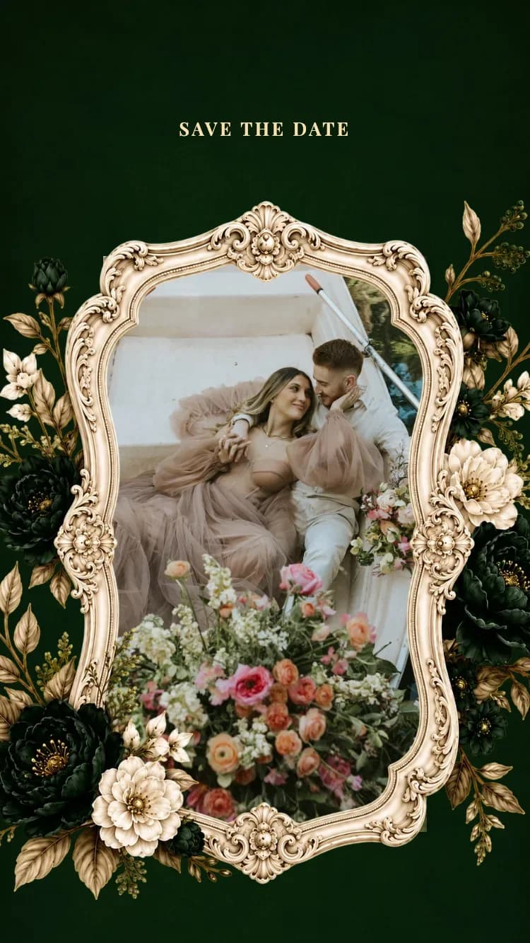
A near-black forest damask ground with a carved baroque cartouche around the couple photo, deep green and cream peonies, and gold rules between every section.
Baroque II - Dark Red
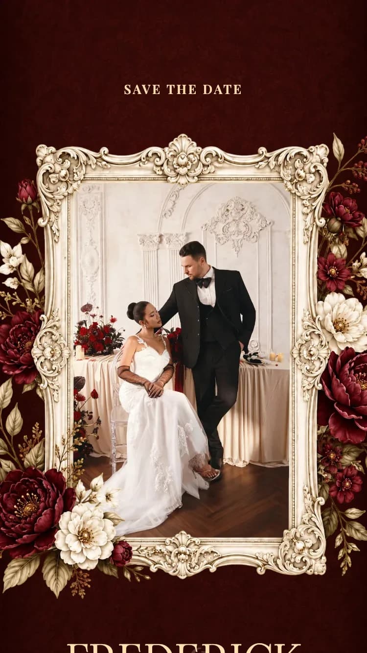
A near-black burgundy damask ground with an ornate gilded baroque frame around the couple photo, burgundy and cream peonies, and gold rules between every section.
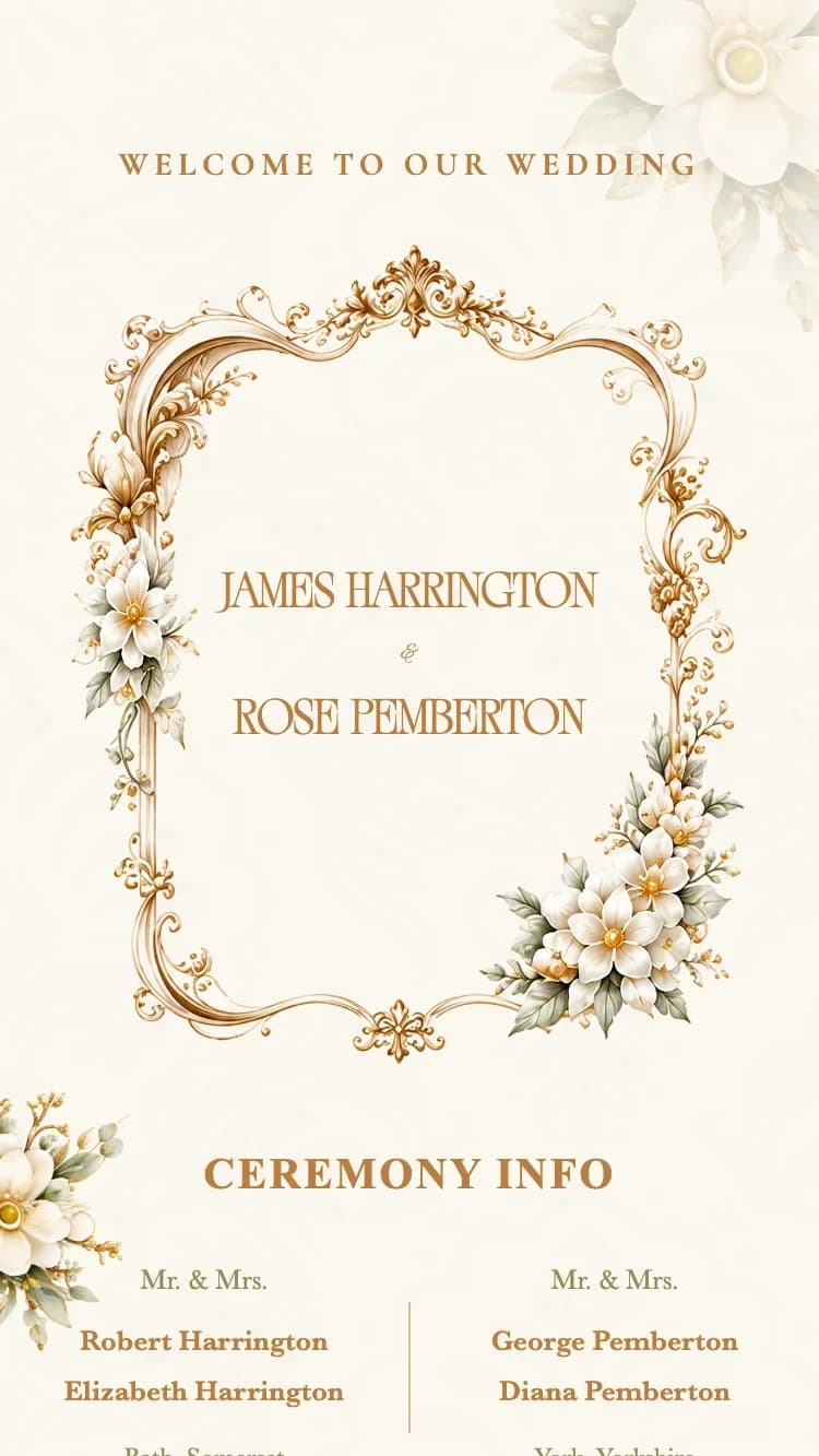
Baroque - Gold
Ornate baroque gold frame and pillars on ivory, with gold-bronze and olive accents. Viaoda Libre + EB Garamond typography for a luxurious European feel.

